Uber Motion Guidelines
01. Shortcomings of the brand guideline
While Uber has a comprehensive brand guide, it lacked specific direction for motion graphics and video. This gap led to varying interpretations across teams and external partners, resulting in campaign videos that often looked inconsistent and disconnected.


02. How Uber Moves
Uber is all about moving people forward, and the motion design should reflect that core idea. I drew inspiration from the movement within the Uber app itself, leveraging the brand’s existing equity to create this motion guideline.
At its core, the motion is simple and smooth, always moving from left to right to convey progress. The speed of animation is loosely based on the app's animation, creating a sense of familiarity whether you're watching an Uber ad on YouTube or using the app.
This motion guideline focuses on three key elements: color, logo, and typography.

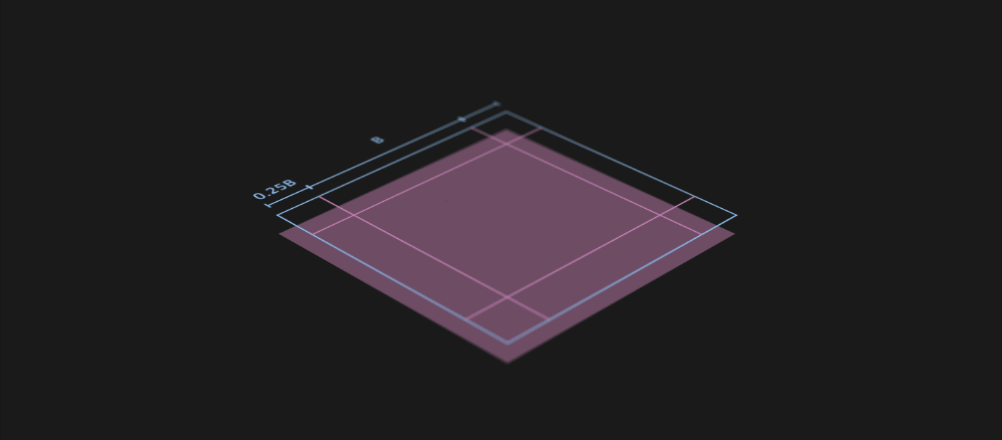
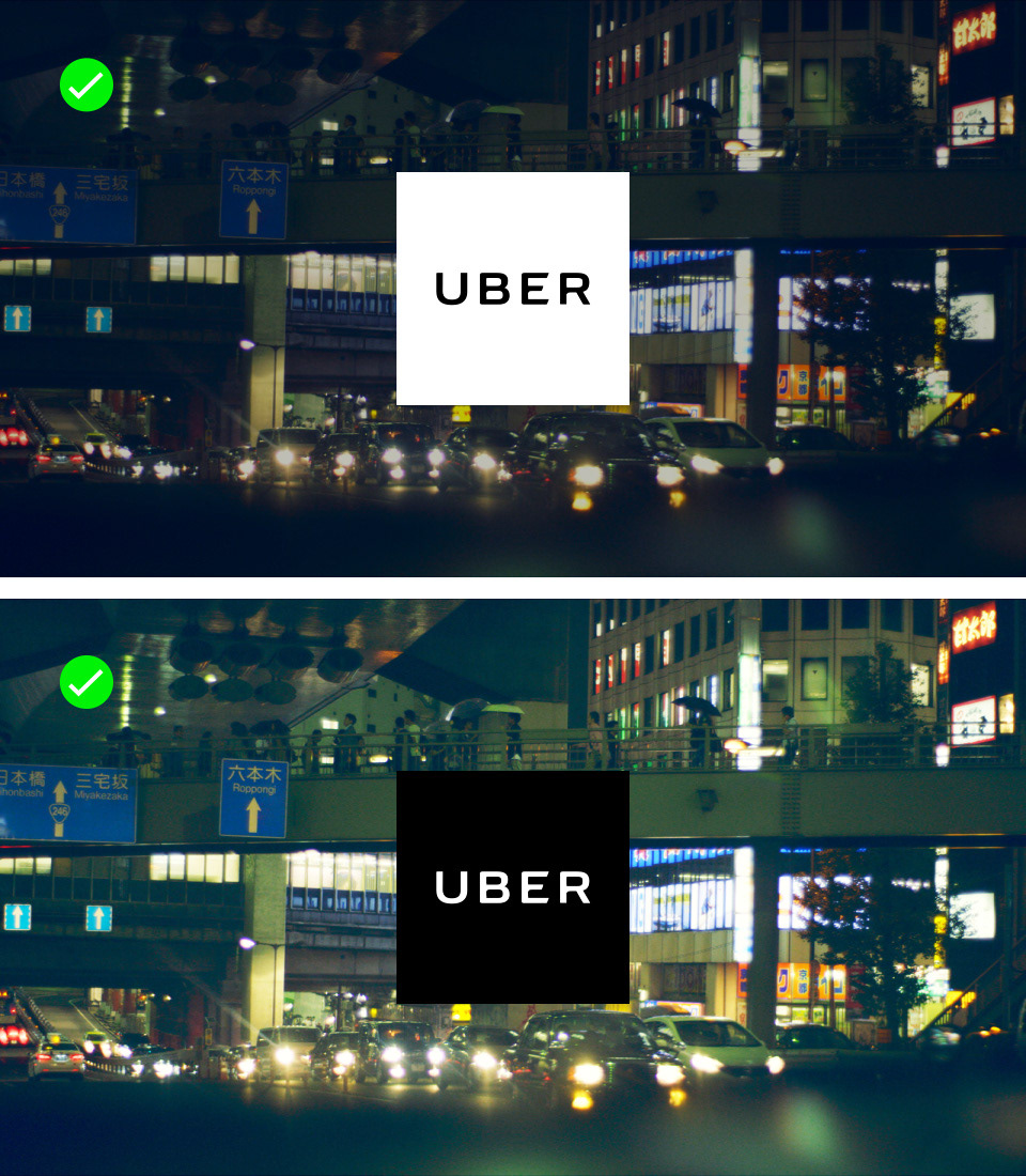
03. Wordmark
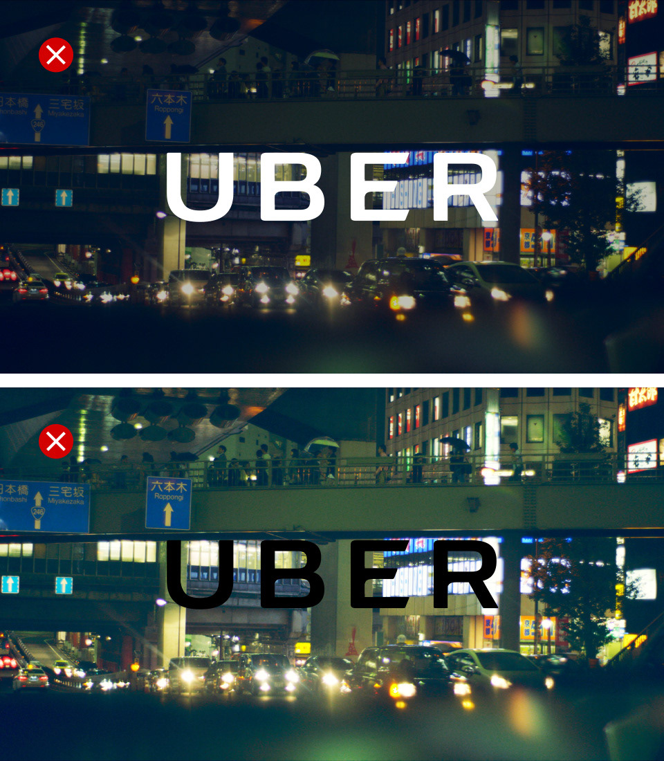
The Uber wordmark animation is quick and straightforward, perfect for squeezing into a 6-second YouTube ad. However, when used as an overlay on video, legibility can become an issue. To maintain clarity, this guideline discourages using the wordmark as a video overlay.

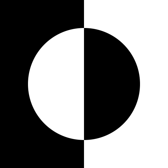
04. Logobit
The Uber logobit, which combines the wordmark and the bit, is animated from left to right in line with the motion principle. Unlike the wordmark, the logobit works much better as a video overlay, making it the preferred solution.
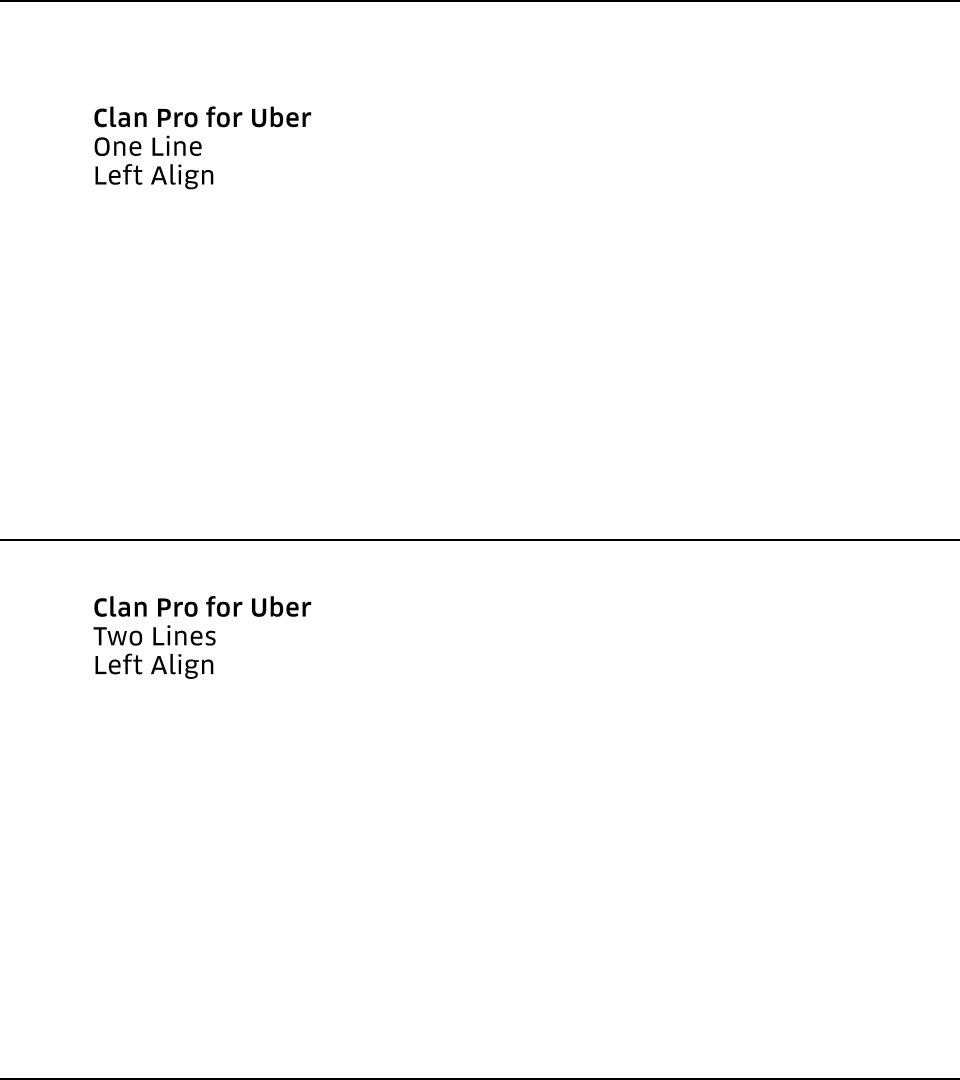
05. Typography
Uber’s typeface, Clan Pro, is used across all English-speaking regions. Typography animation should feel effortless and smooth, just like an Uber ride. For video, supers should always be short and concise, maintaining clarity and ease of reading.
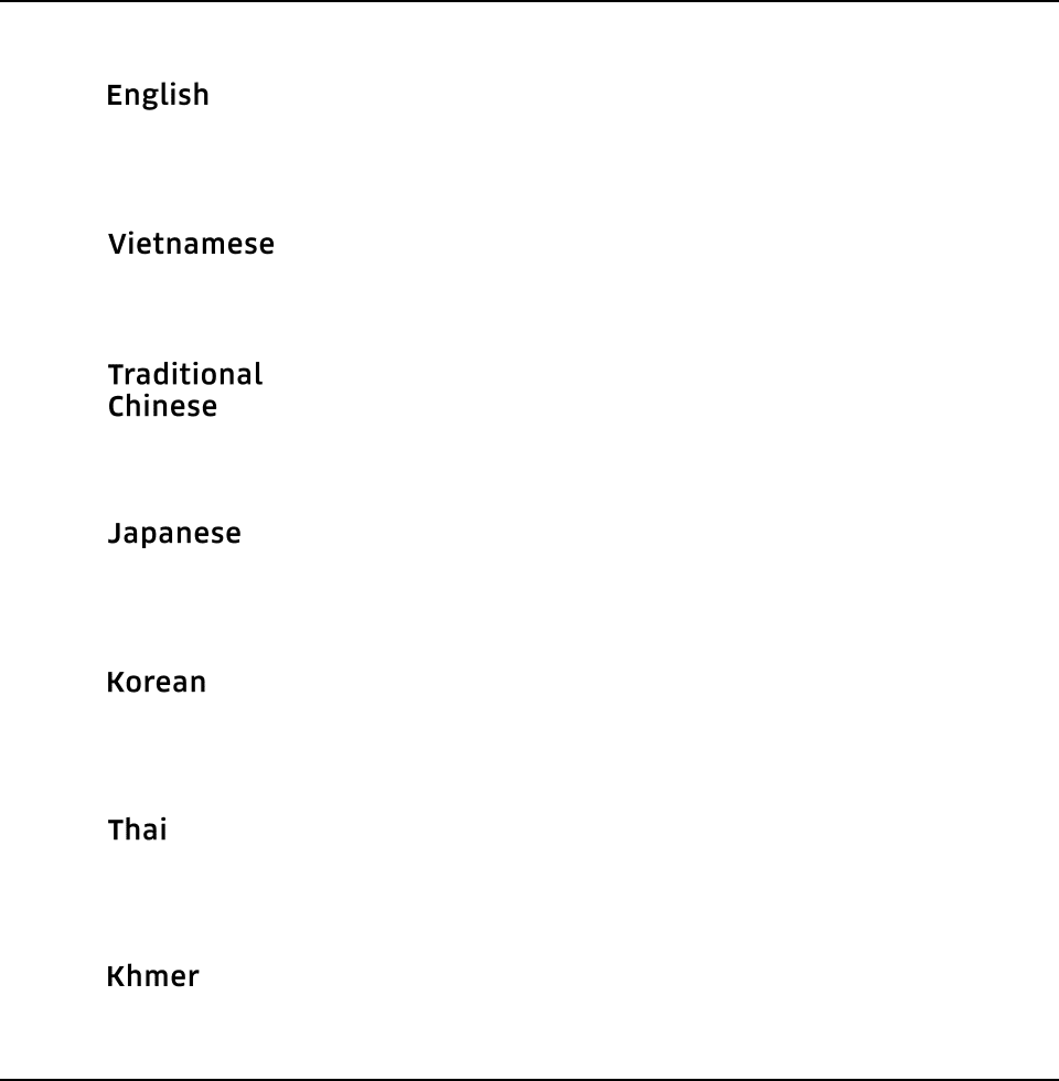
06. Foreign Language
In the Asia Pacific region, Uber operates in 15 countries with 11 different languages. The same type animation is adapted across all these languages to ensure consistency in the animation style, regardless of the region.
Combining Elements
Logo Lockups
Using the established elements, we can combine them into a lockup. A lockup consists of the logobit, tagline, and badges from Google and Apple. These animated logo lockups are used at the start or end of a video to build brand recognition.
Lockups vary in duration to complement the length of the video. For short YouTube bumper ads, a quick lockup works best, while longer videos can afford a more complete lockup.

Combining Tagline and Logobit in a Lockup

Logobit transforming into the Uber App Icon for visual recognition
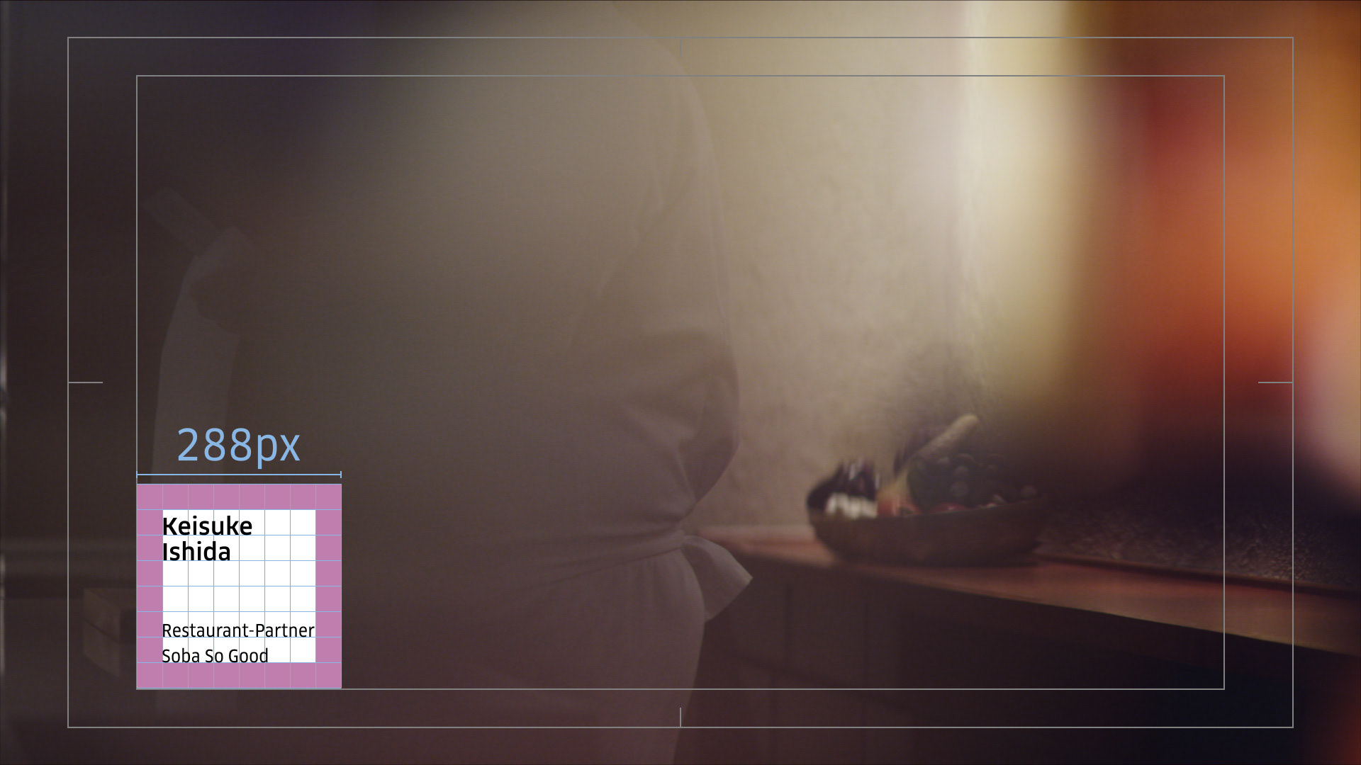
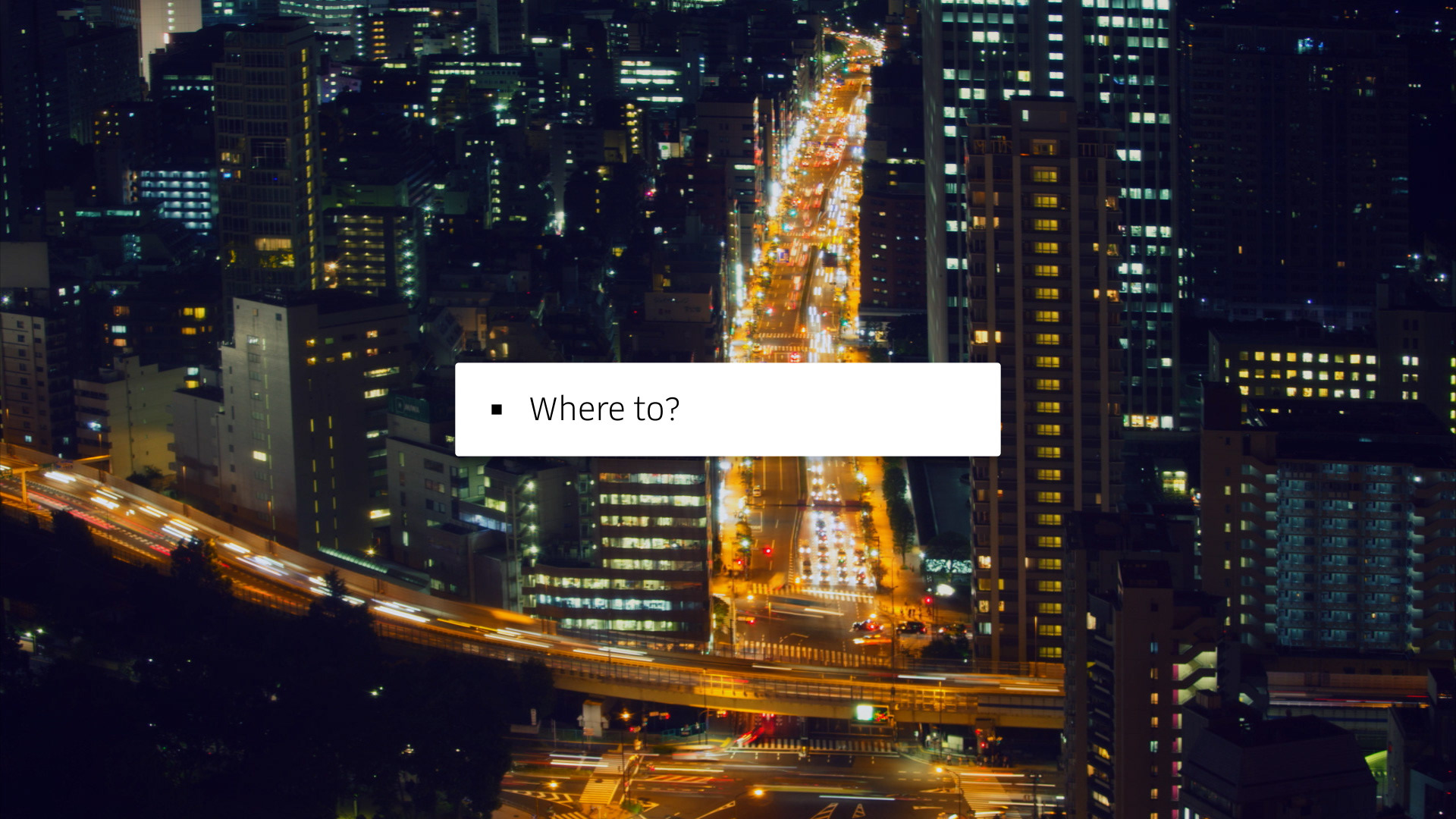
Supers, Lower Thirds & Subtitles
Establishing basic guidelines for other on screen elements such supers, lower thirds and subtitles rounds up the motion guideline. All these guides are in place to ensure that the branding remains consistent without too many restrictions on creative direction such as colour grading, editing style etc.
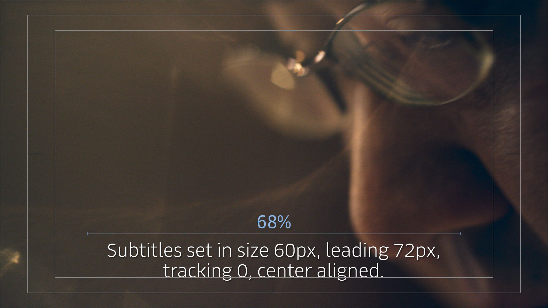
Subtitles are in a larger size because most of Uber's content are on social channels such as Facebook and Instagram, where the bulk of the audience consumes content on mobile phones.